

Analyzing a company’s profit and loss through diagrams is a critical element of economic theory and practice, as it determines the company’s survival. Understanding how the combination of prices and quantities affects a company’s financial outcomes is fundamental for decision-making, both within the company and in the broader economic environment.
Profit arises when a company earns more money from its activities than it spends on all kinds of expenses and production costs. If fixed and variable costs exceed total revenues, then the company incurs a loss (Mankiw & Taylor, 2010). Analyzing these cases through diagrams allows interested parties to easily understand the company’s trajectory through visual representation, in order to plan strategies that the business could adopt to maximize its profits or minimize its losses.
In Table 1, we introduce hypothetical data, on which the following diagrams are based.
Table 1
| Q | P | TR | MR | AR | FC | VC | TC | AC | MC | PROFIT |
| 1 | 110 | 110 | 120 | 110 | 20 | 80 | 100 | 100,0 | – | 10 |
| 2 | 105 | 210 | 100 | 105 | 20 | 100 | 120 | 60,0 | 20 | 90 |
| 3 | 100 | 300 | 90 | 100 | 20 | 112 | 132 | 44,0 | 12 | 168 |
| 4 | 95 | 380 | 80 | 95 | 20 | 122 | 142 | 35,5 | 10 | 238 |
| 5 | 90 | 450 | 70 | 90 | 20 | 142 | 162 | 32,4 | 20 | 288 |
| 6 | 85 | 510 | 60 | 85 | 20 | 170 | 190 | 31,7 | 28 | 320 |
| 7 | 80 | 560 | 50 | 80 | 20 | 220 | 240 | 34,3 | 50 | 320 |
| 8 | 75 | 600 | 40 | 75 | 20 | 288 | 308 | 38,5 | 68 | 292 |
| 9 | 70 | 630 | 30 | 70 | 20 | 380 | 400 | 44,4 | 92 | 230 |
| 10 | 65 | 650 | 20 | 65 | 20 | 490 | 510 | 51,0 | 110 | 140 |
| 11 | 60 | 660 | 10 | 60 | 20 | 640 | 660 | 60,0 | 150 | 0 |
| 12 | 55 | 660 | 0 | 55 | 20 | 840 | 860 | 71,7 | 200 | -200 |
| 13 | 50 | 650 | -10 | 50 | 20 | 1080 | 1100 | 84,6 | 240 | -450 |
| 14 | 45 | 630 | -20 | 45 | 20 | 1380 | 1400 | 100,0 | 300 | -770 |
| 15 | 40 | 600 | -30 | 40 | 20 | 1735 | 1755 | 117,0 | 355 | -1155 |
| 16 | 35 | 560 | -40 | 35 | 20 | 2166 | 2186 | 136,6 | 431 | -1626 |
| 17 | 30 | 510 | -50 | 30 | 20 | 2671 | 2691 | 158,3 | 505 | -2181 |
| 18 | 25 | 450 | -60 | 25 | 20 | 3263 | 3283 | 182,4 | 592 | -2833 |
| 19 | 20 | 380 | -70 | 20 | 20 | 3948 | 3968 | 208,8 | 685 | -3588 |
| 20 | 15 | 300 | -80 | 15 | 20 | 4736 | 4756 | 237,8 | 788 | -4456 |
Where:
\[
\begin{align*}
Q &= \text{Quantity} \\
P &= \text{Price} \\
TR &= \text{Total Revenue} \\
MR &= \text{Marginal Revenue} \\
AR &= \text{Average Revenue} \\
FC &= \text{Fixed Cost} \\
VC &= \text{Variable Cost} \\
TC &= \text{Total Cost} \\
AC &= \text{Average Cost} \\
MC &= \text{Marginal Cost} \\
\text{Profit} &= \text{Profit}
\end{align*}
\]
a) To present profit, we create a diagram focusing on the points of interest, selecting specific columns \((MR, AR, AC, MC)\) and placing the quantity \(Q\) on the x-axis and the price on the y-axis. For clarity, we choose up to the quantity 11, where the profit becomes zero (Diagram 1).
Diagram 1
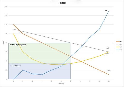
\(MR (Marginal Revenue)\): This (orange) line represents the additional revenue a company earns for each additional unit sold.
\(AR (Average Revenue)\): The (gray) line represents the revenue received for each unit sold. Average revenue is calculated by dividing total revenue \((TR)\) by the quantity sold \((Q)\).
\(AC (Average Cost)\): The (yellow) U-shaped line is the average production cost per unit and is calculated by dividing the total cost \((TC)\) by the produced quantity \((Q)\).
\(MC (Marginal Cost)\): This (blue) line shows the cost of producing one more unit, which generally increases after a certain point as production becomes less efficient.
The curves of marginal revenue \((MR – Marginal Revenue)\) and average revenue \((AR – Average Revenue)\) are decreasing, as is the demand curve for the company’s product/service. This means that to sell more units, the company must reduce the price of its product, so the additional revenue from the sale of each next unit is less than the revenue of the previous unit, as happens in markets of monopolistic competition, perfect competition, or products/services with elastic demand.
The average cost curve \((AC – Average Cost)\), in the initial phase, as production increases, appears to decrease. This happens because fixed costs (such as rent, administrative expenses, equipment costs, etc.) are distributed over a larger number of produced units, reducing the cost per unit. After a point, the average cost begins to increase due to decreasing efficiency, with possible causes being the size or increased complexity in the coordinating function of the business, etc.
The marginal cost \((MC – Marginal Cost)\) increases at a point due to the cost of producing additional units (from 1 to 2 units). It then falls until the quantity \(Q=4\) and begins to increase again due to the Law of Diminishing Marginal Returns (Law of Diminishing Marginal Returns – definition, 2010).
The area reflecting profit is marked with the rectangle (in green color) created from the point of the average revenue curve \((AR – Average Revenue)\) corresponding to the profit-maximizing price \((P*=80)\) and the point of the average cost curve \((AC – Average Cost)\) corresponding to the price \(P=34.3\) (Table 1) as well as the quantity axis for \(Q*=7\). Profit occurs when the average revenue per unit (selling price) is higher than the average cost per unit \((AR>AC)\). At the same time, we observe that at the profit-maximizing quantity \(Q*=7\), the price is the same for Marginal Cost and Marginal Revenue \((MC=MR=50)\). The intersection of \(MC\) and \(MR\) is the point where profit maximization occurs and is defined in Table 1 in green color. That is, the company continues to produce until the cost of creating one more unit \((MC)\) is equal to the revenues generated from the sale of this unit \((MR)\). This in the table occurs at the quantity \(Q*=7\) and price \(P*=80\) (quantity and price of profit maximization). When \(MR>MC\), businesses increase their profits and the total profit increases. When \(MR<MC\), the total profit begins to decrease. Therefore, profit is maximized where \(MR = MC\) (Pseiridou & Lianos, 2015).
Mathematical proof of the rectangle area:
\(Profit=7×(80-34.3)=319.9\)
Approximately 320 monetary units, as in Table 1. This is also proven by subtracting the area under the average cost curve
\(TC=34.3×7=240.1\)
from the area of the rectangle representing total revenues
\(TR=PxQ=80×7=560\)
Therefore,
\(Profit=TR-TC=560-240.1=319.9\)
The intersection of the Marginal Cost \((MC)\) curve with the Average Cost \((AC)\) curve indicates the point where the average cost is at its minimum. This happens because marginal cost reflects the cost of producing an additional unit of product, and when this is equal to the average cost, then each additional unit produced has the same cost as the average cost of the already produced units. Specifically, when \(MC\) is still below \(AC\), it means that the cost of producing the next unit is less than the average cost of the previous units, making production more efficient and reducing the average cost. At the point where \(MC\) meets \(AC\), marginal cost is equal to average cost. This point is the minimum of the \(AC\) curve and symbolizes the most efficient scale of production for the business. When \(MC\) is above \(AC\), each additional unit produced increases the average cost, i.e., the cost of production becomes less efficient. This point of minimum average cost is crucial for understanding the cost structure of a business (Perloff, 2018). However, at this point, the business does not necessarily make a profit.
Profit exists only when the average revenue per unit \((AR)\) exceeds the average cost \((AC)\).
If \(AR >AC\), the business makes a profit because the revenue per unit exceeds the production cost per unit.
If \(AR=AC\), in our case at quantity \(Q=11\), the business is at the “break-even point,” meaning it neither makes a profit nor incurs a loss.
If \(AR<AC\), the business incurs a loss because the production cost per unit exceeds the revenue per unit, and in the long run, this is not sustainable (Kilintzis, n.d.).
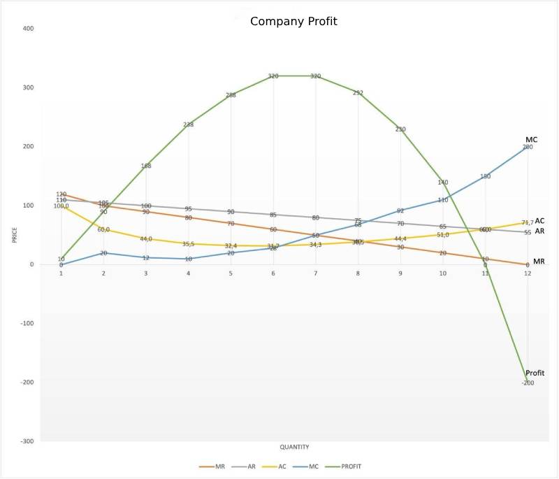
The course of profit is shown by the green line in Diagram 2.
Diagram 2
b) Let’s diagrammatically present the case of loss, using the data from the same table, selecting the columns \((TR, TC)\), and placing the quantity \(Q\) on the horizontal axis and the revenues/expenses on the vertical axis. For clarity, we choose up to the quantity 14 (Diagram 3).
Diagram 3
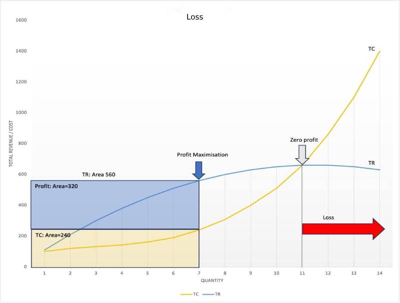
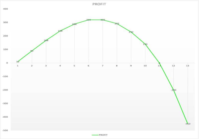
The above Diagram 3, at its top, shows the relationship between Total Revenue \((TR)\), Total Cost \((TC)\), and the quantity of production. \(TC\) increases steadily with quantity, while \(TR\) initially increases but then decreases, based on the law of diminishing returns (Law of Diminishing Marginal Returns – definition, 2010). At the quantity \(Q=11\), the profit is nullified, as seen from Table 1, but also from the lower part of Diagram 3, which depicts the profit curve. This point of zero profit, where \(TR\) and \(TC\) intersect, is called the “break-even point,” where the business neither makes a profit nor incurs a loss (Kilintzis, n.d.). From the point where \(TC\) exceeds \(TR\) and beyond, the business incurs losses. This is shown on the right side of the upper part of the graph and is indicated by the red arrow pointing right (Loss). The profit curve in the lower part of the graph confirms the above statement, passing from \(Q=11\) to the negative part of the vertical axis. In summary, the business starts to show profits from the first intersection point of \(TR\) and \(TC\) \((Q=1)\) and ceases at the second intersection point \((Q=11)\). From there on, it incurs losses.
Bibliographical References
Mankiw G. N. & Taylor M.P. (2010, μετάφραση), «Αρχές Οικονομικής Θεωρίας», Τόμος Α’ – Μικροοικονομική, εκδόσεις Gutenberg
Perloff, J. M. (2018). Microeconomics. Pearson.
Κιλίντζης, Δρ. Π. (n.d.). Προσδιορισμός Νεκρού σημείου (Break Even Analysis). In Πανεπιστήμιο Δυτικής Μακεδονίας. Retrieved November 18, 2023, from here
Νόμος της Φθίνουσας Οριακής Απόδοσης (Law of diminishing marginal returns) – ορισμός. (2010, June 24). Ευρετήριο Οικονομικών Όρων. Retrieved November 18, 2023, from here
Ψειρίδου, Α., & Λιανός, Θ. (2015). Οικονομική ανάλυση & πολιτική – Μικροοικονομική.