Starting with a Jupyter Notebook for financial analysis involves several steps: setting up your environment, importing necessary libraries, loading the dataset, and then proceeding with the analysis. Below is a structured way to begin your analysis, focusing on initial steps such as data loading, cleaning, descriptive statistics, and a simple visualization.
### Step 1: Environment Setup
Make sure you have Jupyter Notebook installed, which is part of the Anaconda distribution, a popular choice for data science and analytics in Python. You’ll also need to install specific libraries if they aren’t already available in your environment, primarily `pandas` for data manipulation, `matplotlib` and `seaborn` for visualization, and `numpy` for numerical operations.
### Step 2: Starting Your Jupyter Notebook
– Open your command line or terminal.
– Navigate to the directory where your dataset is stored using `cd path/to/your/dataset/directory`.
– Start Jupyter Notebook by typing `jupyter notebook` and press Enter. Your browser will open with the Jupyter dashboard.
– In the dashboard, click on “New” > “Python 3” to create a new notebook.
### Step 3: Writing Your Code
Write the code into a new cell in your Jupyter Notebook and run it by pressing `Shift + Enter`. Example:
# Import necessary libraries
import pandas as pd
import matplotlib.pyplot as plt
import seaborn as sns
import numpy as np

# Ensure that plots are displayed inline in the Jupyter notebook
%matplotlib inline

# Load the dataset
file_path = 'Bank_Stock_Price_10Y.csv' # Make sure the file path matches where you've stored your dataset
data = pd.read_csv(file_path)

# Display the first few rows of the dataset
print(data.head())
You can download the dataset here.
Your dataset contains stock price data over a period of 10 years, with the following columns:
– **Date**: The date of the stock data entry.
– **Open**: The price at which the stock first traded upon the opening of the exchange that day.
– **High**: The highest price at which the stock traded during the trading day.
– **Low**: The lowest price at which the stock traded during the trading day.
– **Close**: The price at which the stock last traded upon the close of the exchange that day.
– **Adj Close**: The closing price after adjustments for all applicable splits and dividend distributions.
– **Volume**: The number of shares that changed hands during the trading day.
Given this structure, here are a few suggestions on what you can do with this dataset for learning purposes:
1. **Data Visualization**: Learn how to visualize financial data. You can plot the stock’s closing price and volume over time to understand its trend. Additionally, plotting moving averages could help identify the stock’s direction.
2. **Time Series Analysis**: This dataset is a perfect candidate for time series analysis. You can learn about concepts such as stationarity, autocorrelation, and seasonality. Implementing models like ARIMA (AutoRegressive Integrated Moving Average) could be a great exercise.
3. **Predictive Modeling**: Use machine learning to predict future stock prices. Start with simpler models like linear regression and gradually move to more complex ones like LSTM (Long Short-Term Memory) neural networks.
4. **Volatility Analysis**: Analyze the stock’s volatility by calculating metrics like the average true range (ATR) or by applying the GARCH (Generalized Autoregressive Conditional Heteroskedasticity) model.
5. **Event Study**: Investigate how specific events (e.g., financial crises, CEO changes, product launches) have impacted the stock’s price. This involves comparing stock prices before and after the event.
6. **Portfolio Simulation**: If you have access to similar datasets for other stocks, you can simulate creating a diversified stock portfolio. Learn about portfolio optimization, risk assessment, and the Sharpe ratio.
7. **Technical Analysis**: Apply technical analysis indicators such as Moving Average Convergence Divergence (MACD), Relative Strength Index (RSI), Bollinger Bands, and others to make trading decisions based on price and volume movements.
8. **Correlation Analysis**: Analyze how this stock’s price movements correlate with other stocks, market indices, or external factors like interest rates and economic indicators.
Let’s see a few examples below:
Data Cleaning and Preparation: Understand the data: Familiarize yourself with each column and what it represents. Check for missing values: Financial datasets often have missing values due to market closure on weekends and holidays. Decide how you’ll handle these—fill them, drop them, or interpolate. Adjust for splits and dividends: Ensure the ‘Adj Close’ column accounts for any stock splits and dividends. This dataset has an ‘Adj Close’ column, indicating this adjustment has been made.
# Import necessary libraries
import pandas as pd
import matplotlib.pyplot as plt
import seaborn as sns
import numpy as np

# Ensure that plots are displayed inline in the Jupyter notebook
%matplotlib inline

# Continue with your data loading and analysis as planned...
# Replace 'file_path' with the actual path to your CSV file
file_path = 'Bank_Stock_Price_10Y.csv'

# Load the CSV file into a pandas DataFrame
data = pd.read_csv(file_path)

print(data)
Descriptive Analysis Summary statistics: Calculate mean, median, standard deviation, min, and max for each column. This provides a quick overview of the dataset’s characteristics. Trend analysis: Plot the closing price over time to visualize trends, seasonality, and any outliers. This can help identify periods of high volatility or stability.
# Basic descriptive statistics

print(data.describe())

Technical Analysis Moving Averages: Calculate and plot short-term and long-term moving averages (e.g., 50-day and 200-day) to identify potential buy or sell signals. Volume Analysis: Analyze trading volume in conjunction with price movements to confirm trends. Volatility: Calculate volatility measures, such as the historical volatility or the Average True Range (ATR), to understand the risk associated with the stock.
Step 1: Plotting the Closing Price Over Time: This will give us a straightforward visualization of how the stock price has moved over the years in your dataset.
# Convert 'Date' to datetime and set as index
data['Date'] = pd.to_datetime(data['Date'])
data.set_index('Date', inplace=True)

plt.figure(figsize=(20, 7))
plt.plot(data.index, data['Close'], label='Close Price')

# Rotate the date labels and set a format
plt.xticks(rotation=45) # Rotate the labels for better readability
plt.gca().xaxis.set_major_locator(plt.MaxNLocator(10)) # Reduce the number of x-axis labels

plt.title('Closing Price Over Time')
plt.xlabel('Date')
plt.ylabel('Close Price (in Currency)')
plt.tight_layout() # Adjust the padding between and around subplots.
plt.legend()
plt.show()

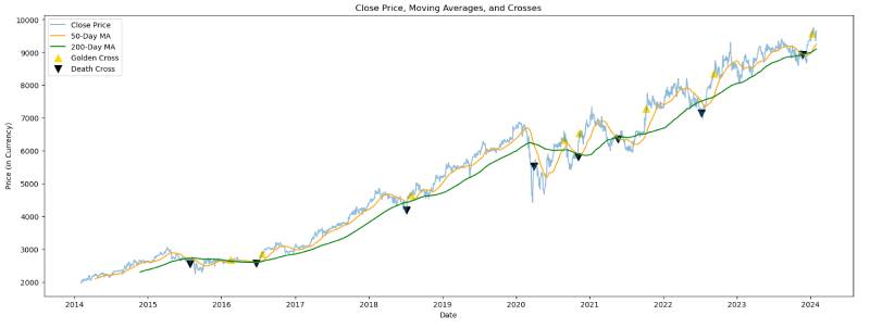
Step 2: Calculating and Plotting Moving Averages: We’ll calculate two moving averages: a short-term (e.g., 50-day) and a long-term (e.g., 200-day) moving average. The crossing of these two averages is often used to signal potential buy or sell points (golden cross and death cross). Moving averages help identify trends and potential turning points in stock prices. A golden cross occurs when a shorter moving average (like the 50-day) crosses above a longer moving average (like the 200-day), suggesting a bullish (upward) market trend. Conversely, a death cross suggests a bearish (downward) trend when the shorter moving average crosses below the longer one.
# Find golden cross points
golden_crosses = data[(data['MA50'] > data['MA200']) & (data['MA50'].shift(1) <= data['MA200'].shift(1))]

# Find death cross points
death_crosses = data[(data['MA50'] < data['MA200']) & (data['MA50'].shift(1) >= data['MA200'].shift(1))]

# Plot the points of golden and death crosses
plt.figure(figsize=(20, 7))
plt.plot(data.index, data['Close'], label='Close Price', alpha=0.5)
plt.plot(data.index, data['MA50'], label='50-Day MA', color='orange')
plt.plot(data.index, data['MA200'], label='200-Day MA', color='green')
plt.scatter(golden_crosses.index, golden_crosses['Close'], label='Golden Cross', marker='^', color='gold', s=100)
plt.scatter(death_crosses.index, death_crosses['Close'], label='Death Cross', marker='v', color='black', s=100)
plt.title('Close Price, Moving Averages, and Crosses')
plt.xlabel('Date')
plt.ylabel('Price (in Currency)')
plt.legend()
plt.show()
Volume analysis is a useful next step. It involves examining the trading volume (how many shares are traded for a given period) to confirm trends and look for signals of potential reversals. High trading volumes can indicate strong interest in a stock, either positive or negative, and can accompany significant price moves or trend reversals.
# Create a figure and a grid of subplots
fig, ax1 = plt.subplots(figsize=(14, 7))

# Plot the closing price on the primary y-axis (ax1)
color = 'tab:blue'
ax1.set_xlabel('Date')
ax1.set_ylabel('Close Price (in Currency)', color=color)
ax1.plot(data.index, data['Close'], label='Close Price', color=color)
ax1.tick_params(axis='y', labelcolor=color)

# Instantiate a second y-axis sharing the same x-axis (ax2)
ax2 = ax1.twinx()

# Plot the trading volume on the secondary y-axis (ax2)
color = 'tab:red'
ax2.set_ylabel('Volume', color=color)
ax2.fill_between(data.index, 0, data['Volume'], label='Volume', color=color, alpha=0.3)
ax2.tick_params(axis='y', labelcolor=color)

# Title and legend
fig.tight_layout() # To ensure the subplot fits into the figure area
fig.suptitle('Close Price and Volume Over Time', fontsize=16, y=1.02)
ax1.legend(loc='upper left')
ax2.legend(loc='upper right')

plt.show()

Here is the combined plot showing both the closing price and the trading volume over time. The blue line represents the closing price of the stock, plotted against the left y-axis, while the red-shaded area indicates the trading volume, plotted against the right y-axis.
By examining this plot, you can begin to analyze how the trading volume relates to price movements. Look for patterns such as:
Volume spikes that coincide with significant price increases or decreases, which might indicate strong buyer or seller interest and could be a signal of a continuing trend or an upcoming reversal. Days with unusually high volume and relatively small price movements, which might suggest a consolidation period. Consistently high or low volumes during certain periods, which could correlate with market sentiment or specific events affecting the stock. If you observe volume spikes that correspond with substantial price movements, it could validate the price trend. Conversely, if volume spikes occur without significant changes in price, it may indicate uncertainty or a potential change in the market sentiment. This analysis can be quite insightful when making buy or sell decisions.
# Calculate daily returns
data['Daily Return'] = data['Close'].pct_change()

# Calculate historical volatility (standard deviation of daily returns over the past year, annualized)
historical_volatility = data['Daily Return'].std() * (252 ** 0.5) # Assuming 252 trading days in a year

# Calculate the True Range and the Average True Range (ATR)
data['High-Low'] = data['High'] - data['Low']
data['High-PrevClose'] = abs(data['High'] - data['Close'].shift())
data['Low-PrevClose'] = abs(data['Low'] - data['Close'].shift())
data['True Range'] = data[['High-Low', 'High-PrevClose', 'Low-PrevClose']].max(axis=1)
data['ATR'] = data['True Range'].rolling(window=14).mean() # 14-day ATR

# Plot the closing price, ATR, and historical volatility
fig, ax1 = plt.subplots(figsize=(20, 7))

ax1.set_xlabel('Date')
ax1.set_ylabel('Close Price', color='tab:blue')
ax1.plot(data.index, data['Close'], color='tab:blue')
ax1.tick_params(axis='y', labelcolor='tab:blue')

ax2 = ax1.twinx()
ax2.set_ylabel('ATR', color='tab:orange')
ax2.plot(data.index, data['ATR'], color='tab:orange')
ax2.tick_params(axis='y', labelcolor='tab:orange')

plt.title('Stock Close Price and Average True Range (ATR)')
plt.show()

print(f"Historical Volatility: {historical_volatility:.2%}")

The first plot above shows the daily returns of the stock, which gives us an indication of the historical volatility. The historical volatility is calculated as the standard deviation of the daily returns, which in this case is 1.44%. This percentage represents the average fluctuation in the stock’s price over the past year on a daily basis.
The second plot is the Average True Range (ATR), which is a measure of market volatility. It takes into account the range of the stock price for each day (including any gap from the close of the previous day) and averages this over a typical 14-day period. The ATR can help traders understand the volatility and potential price movement range for the stock, which is useful for setting stop-loss levels and for understanding the stock’s stability.
A higher ATR value indicates a more volatile stock, which could mean higher risk but also the potential for higher returns. Conversely, a lower ATR value suggests a less volatile stock, indicating lower risk and potentially smaller price movements. These metrics are crucial for risk management and decision-making in trading strategies.
Predictive Modeling Linear Regression: Use regression analysis to forecast future stock prices based on historical data, though be mindful of its limitations in capturing complex market behaviors. Time Series Analysis: Implement ARIMA or Seasonal ARIMA (SARIMA) models to predict future price movements based on the time series characteristics of the data.
from sklearn.model_selection import train_test_split
from sklearn.linear_model import LinearRegression
from sklearn.metrics import mean_squared_error

# Use the 'Close' price as the feature and target variable
X = data[['Close']].values[:-1] # Features (previous close prices)
y = data['Close'].values[1:] # Target (next day's close prices)

# Split the data into training and testing sets
X_train, X_test, y_train, y_test = train_test_split(X, y, test_size=0.2, random_state=0, shuffle=False)

# Create and train the linear regression model
model = LinearRegression()
model.fit(X_train, y_train)

# Predict on the test set
y_pred = model.predict(X_test)

# Calculate the RMSE
rmse = mean_squared_error(y_test, y_pred, squared=False)

# Print out the RMSE
print(f"RMSE: {rmse}")

# Plot the actual vs predicted prices
plt.figure(figsize=(14, 7))
plt.plot(data.index[-len(y_test):], y_test, label='Actual Price', color='blue')
plt.plot(data.index[-len(y_test):], y_pred, label='Predicted Price', color='orange', linestyle='--')
plt.title('Actual vs Predicted Stock Prices')
plt.xlabel('Date')
plt.ylabel('Price')
plt.legend()
plt.show()

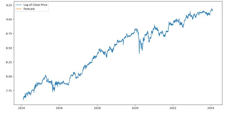
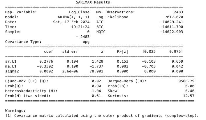
from statsmodels.tsa.arima.model import ARIMA
from statsmodels.graphics.tsaplots import plot_acf, plot_pacf
import matplotlib.pyplot as plt

# Assuming 'data' is your DataFrame and 'Close' is the column with closing prices

# Log transform for stabilizing variance (optional)
data['Log_Close'] = np.log(data['Close'])

# Differencing to remove trend (change d as necessary based on your data)
data['Diff_Log_Close'] = data['Log_Close'].diff().dropna()

# Plot ACF and PACF to help determine the order of ARIMA model
fig, (ax1, ax2) = plt.subplots(2, 1, figsize=(12, 8))
plot_acf(data['Diff_Log_Close'].dropna(), ax=ax1)
plot_pacf(data['Diff_Log_Close'].dropna(), ax=ax2)
plt.show()

# Fit the ARIMA model
# The order (p,d,q) needs to be determined based on the ACF and PACF plots
# Here we use (1,1,1) as an example
model = ARIMA(data['Log_Close'], order=(1, 1, 1))
model_fit = model.fit()

# Summary of the model
print(model_fit.summary())

# Plot diagnostic plots
model_fit.plot_diagnostics(figsize=(15, 12))
plt.show()

# Forecasting
# The number of steps to forecast (e.g., 5 days into the future)
forecast_steps = 5
forecast = model_fit.get_forecast(steps=forecast_steps)
forecast_index = pd.date_range(start=data.index[-1], periods=forecast_steps+1, closed='right')

# Confidence intervals for the forecast
confidence_intervals = forecast.conf_int()

# Plot the data and the forecast with confidence intervals
plt.figure(figsize=(14, 7))
plt.plot(data.index, data['Log_Close'], label='Log of Close Price')
plt.plot(forecast_index, forecast.predicted_mean, label='Forecast')
plt.fill_between(forecast_index, confidence_intervals.iloc[:, 0], confidence_intervals.iloc[:, 1], color='pink', alpha=0.3)
plt.legend()
plt.show()

# Note: To get the forecast in the original scale, you need to back-transform
# using np.exp() if you applied a log transform earlier.


# Forecasting
forecast_steps = 5

# Generate the forecast index manually without using 'closed' argument
# If the last index of your data is not the latest date, adjust accordingly.
last_date = data.index[-1]
forecast_index = pd.date_range(start=last_date, periods=forecast_steps + 1, freq='D')[1:]

# Proceed with forecasting and plotting as before
forecast = model_fit.get_forecast(steps=forecast_steps)
confidence_intervals = forecast.conf_int()

# Plot the data and the forecast with confidence intervals
plt.figure(figsize=(14, 7))
plt.plot(data.index, data['Log_Close'], label='Log of Close Price')
plt.plot(forecast_index, forecast.predicted_mean, label='Forecast')
plt.fill_between(forecast_index, confidence_intervals.iloc[:, 0], confidence_intervals.iloc[:, 1], color='pink', alpha=0.3)
plt.legend()
plt.show()